
Telequote
Roles : UX / UI design, Branding
Tools : Figma, Photoshop
Type of project : Professionnel project
Project overview
TeleQuote is an online platform that allows sales teams to generate real-time quotes for products and services. This project was completed for a telecommunications provider, whose identity has been anonymized for confidentiality reasons.
The platform required a redesign to modernize the interface and improve the user experience, particularly for tablet use. In my role as a graphic designer, I contributed to this project as an UI/UX advisor to the development team responsible for its implementation.
problem
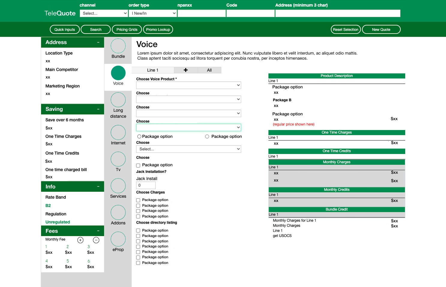
Salespeople complained about the high number of clicks required to generate quotes, as well as the platform’s lack of optimization for the most commonly used device: tablets.
goals
Wireframe
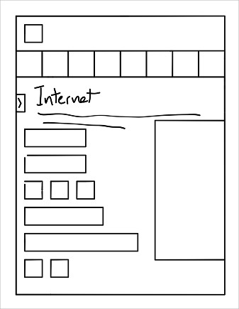
I started by thinking about the overall structure of the platform in order to define the organization of its different sections and features.
Once the basic structure was defined, the project quickly moved into high-fidelity mockup design to meet time constraints and the client’s requirements.
Rethinking customer information input
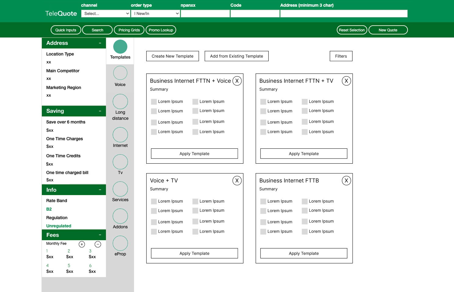
I started with the customer identification process. In the original platform, salespeople had to enter information in the top bar using dropdown menus and small text fields.

I proposed transforming this step into a guided interface, better optimized for tablets and touch interaction. Information is entered step by step, making the experience clearer, reducing errors, and improving navigation.

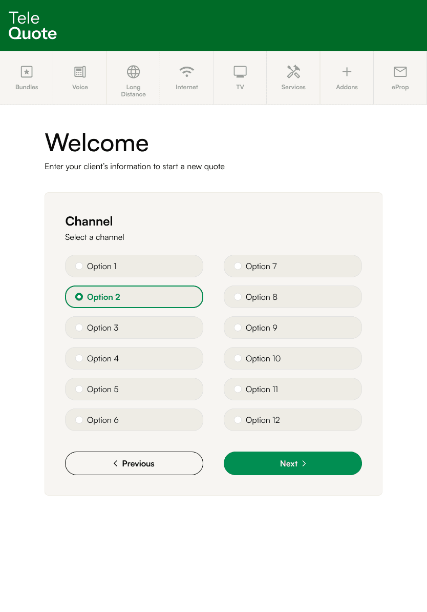
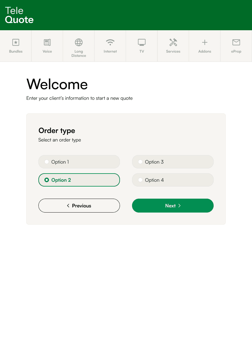

The top bar now serves as a summary of the information and includes two new buttons: one to edit the customer information and another to end the quote.

Several elements were moved and redesigned to optimize space and enable more intuitive navigation on tablets:
1
The quote summary
2
The main navigation
3
The additional options

1
The quote summary
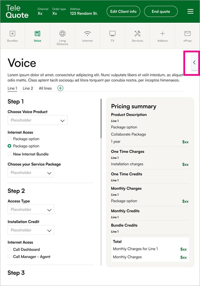
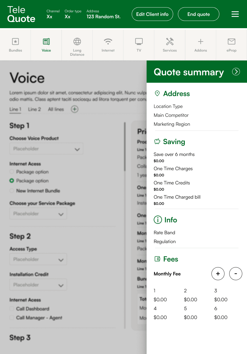
Since this information is only occasionally consulted, the quote summary was placed in a collapsible panel to optimize space.
2
The main navigation
To optimize space usage on tablets, I proposed a horizontal navigation to free up more room for the main content. I also modernized the icons.

3
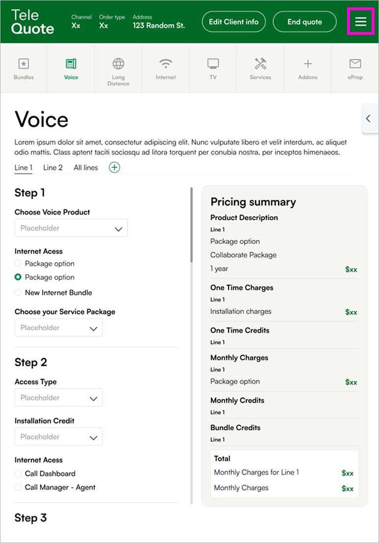
The additional options

Modernize the interface and user experience
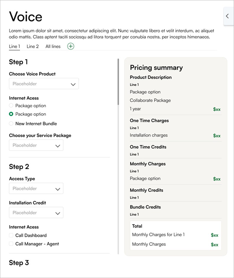
The quote creation interface needed to be modernized and lacked a clear information hierarchy, which made the user experience confusing.
By breaking down the information-gathering process into several steps and adding a clear hierarchy, the experience becomes more intuitive and easier to navigate.

Suggesting new features

What I've Learned
Unfortunately, this project was never completed. It did, however, allow me to improve my ability to streamline an existing interface and organize information more effectively. I also developed my skills in designing interfaces tailored to their context (tablets), while taking into account technical constraints and team decisions.